UX Design
2149
Assignment 2 – Creative Blog
Reflecting on the Creative Decisions behind Flipkart’s Redesigned Interface
Table of Contents
3. Embracing Research and Empathy
4. Building a Strong Foundation: The Sitemap
5. Creating the Wireframe: Designing for Real Humans
6. Focusing on the Product Page and Checkout Flow
7. Writing Content with Personality: Humanising the Brand
8. Applying Core UX Principles throughout the Design
9. Iteration and Learning from Mistakes
10. Practical improvements for future development
1. Introduction
Designing Flipkart’s digital user interface wasn’t just a design problem, it was a deep dive into user psychology, visual aesthetics, and functional simplicity. This project became a perfect blend of creating meaningful user experiences, empathy and problem solving, as I am somebody who really enjoys and thrives with creating both. Whether it is understanding the user pain points, employing UX principles, or making strategic design choices that felt too intuitive or impactful, I never failed to write about the whole journey of Flipkart’s interface redesign in this reflective blog.
2. Identifying the Problem
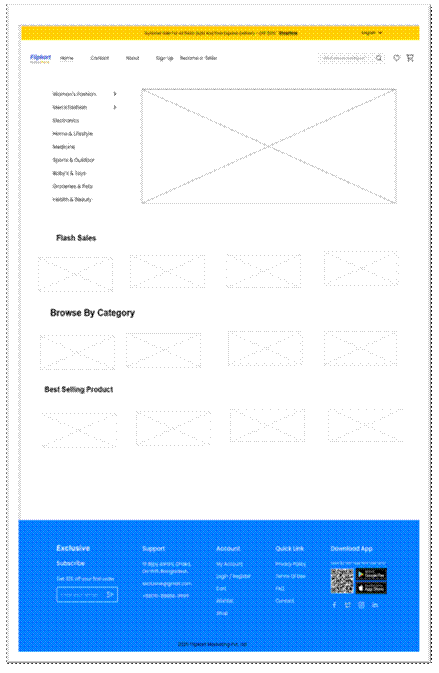
Figure 1: Flipkart’s Website homepage wireframe
(Source: Figma, 2025)
Initially, when I started assessing Flipkart’s existing interface, the reason it had become cluttered was obvious. In terms of products and services offered on the platform, it was enormous, but the homepage was overcrowded with overlapping banners, numerous categories, and the deals loud and clear (Strauss et al.,2024). I did not feel it was a space where users could make their decisions relatively easily.
In fact, the biggest issue I pointed out was information overload. Flipkart’s homepage had too many entry points but users were not offered a clear journey. Menus hid important features like “Track Order”, “Help” and so on (Priyadarsini, 2022). There were many steps in the checkout process with no indications of progress. As a user, this resonated to me as how this challenged me to reimagine a path through these challenges with clarity and purpose.
3. Embracing Research and Empathy
First of all, before jumping into wireframes and layouts, I made sure to familiarize myself with user expectations. I approached this project based on (Chen and Zhai, 2023) UX research framework, in which instance, I studied the user behaviour. I read reviews, closely investigated Flipkart’s app experience, saw what other platforms, like Amazon and eBay had to offer, and talked to a few users about their gripes with e-commerce sites.
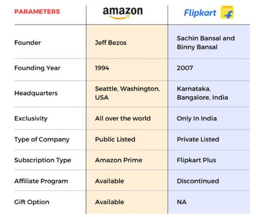
Figure 2: Flipkart vs Amazon aspects
(Source: Stockarea, 2025)
It provided me with immense insights. The site’s structure made many users feel lost. Repetitive ad banners and mismatched product categories were criticized some of whom were annoyed. It dawned on me that the most important first step in designing an impactful solution is to empathise with customers and to get on their journey, both consciously and emotionally.
4. Building a Strong Foundation: The Sitemap
I did my best to have a sense of what users wanted and what they did not want, so first I created a new sitemap. Here it was about me laying the essential on Flipkart’s navigation structure. (Sandil, 2022) The Sitemap of a website functions exactly like a map of a city, and it has to be logically laid out such that visitors do not suffer stress or confusion searching for their destination.
Figure 3: Flipkart’s Website homepage
(Source: Figma, 2025)
I rewrote main navigation bar into more straightforward bigger amounts: “Shop by Category”, “Deals of the Day”, “Track My Order”, and “Customer Support”. These changes reduced decision fatigue while making room for the most-searched features. I also introduced a floating chat support icon that would be available across all pages a small, but user-friendly touch inspired by customer behaviour data.
Using the sitemap as a blueprint, I was able to plan how users would move through Flipkart’s ecosystem from home to checkout in a streamlined, predictable way.
5. Creating the Wireframe: Designing for Real Humans
The next stage was creating a wireframe. Here, my aim was to visually structure each screen before adding colour, images, or branding. I chose a Z-pattern layout for the homepage, which guides the user’s eye from top left to bottom right mirroring natural reading patterns (Albiz et al., 2023). This gave me a clear structure to position the logo, search bar, hero image, product categories, and footer.
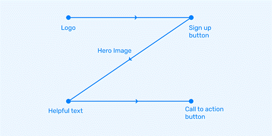
Figure 4: Z-pattern layout for the homepage
(Source: Think360studio, 2025)
I decided to keep only one large promotional banner above the fold. This helped reduce visual noise and placed emphasis on what Flipkart wanted to promote the most like seasonal sales or product launches. Instead of listing 20 product categories immediately, I showcased the top 5 based on sales and user preferences. The rest were made available through a clearly labelled dropdown.
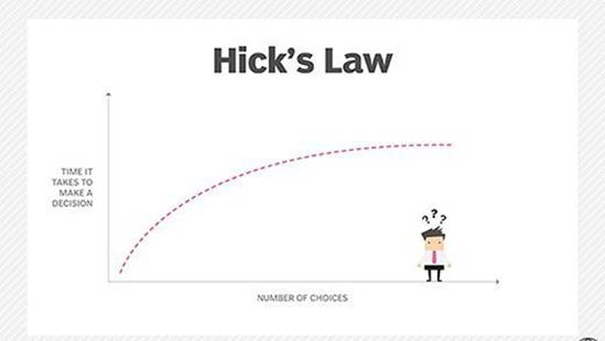
Figure 5: Hick-Hyman Law
(Source: Techtarget, 2025)
This decision was based on the Hick-Hyman Law the idea that the more choices we offer a user, the longer it takes them to make a decision (Hu et al., 2022). Simplifying choices meant faster navigation and less frustration. These small shifts in layout had a massive impact on usability.
6. Focusing on the Product Page and Checkout Flow
One of the most important parts of any e-commerce experience is the product page and checkout process. I reimagined the product page to feel cleaner, more visual, and more persuasive. Instead of overwhelming the user with all information at once, I categorised product descriptions under collapsible sections like “Features”, “Specifications”, “Customer Reviews”, and “Delivery Info”.
I added visual cues like “In Stock”, estimated delivery timelines and verified seller badges (Joshi and Mudliar, 2025). This increased user confidence. Studies show that product ratings are a large influence in decision-making, so product ratings have moved almost centrally in display.
But the checkout flow badly needed a big rewrite. Initially, Flipkart’s checkout was confusing: Users did not know how many steps there were left. At the top of the page I introduced a progress bar in stages: Cart > Address > Payment > Review > Complete. Users had control and transparency with this.
I reduced the number of fields that the users need to fill out by using auto fill for the fields which already have a standard format, saved addresses for frequent addresses, and integration with Google Pay or UPI to ease users (Vidani, 2024). This was based on research which demonstrates that smoother checkout flows result in drastically lower cart abandonment rates.
7. Writing Content with Personality: Humanising the Brand
An often-overlooked element of UX is tone of voice. Many websites get lost in jargon or impersonal copy. I did not want that for Flipkart. I rewrote the “About Us” and “Contact” pages with a friendly, conversational tone explaining Flipkart’s mission, customer promise, and UK presence in language that sounded human.
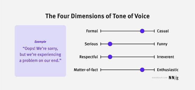
Figure 6: UX is tone of voice
(Source: Nngroup, 2025)
Rather than saying, “You can contact our customer service team 24/7 for any inquiries,” I went with, “Got a question? We’re here for you, day or night. Seriously, try us!” This small shift gave the brand a more approachable vibe. I also embedded customer stories and testimonials into the “About” page, giving it warmth and authenticity.
8. Applying Core UX Principles throughout the Design
Throughout the redesign, I consciously applied key UX design principles. These weren’t just academic guidelines I found them deeply practical. Here’s how they shaped my decisions:
Consistency: I ensured that icons, fonts, and layout patterns remained uniform across the site. Whether someone was on the homepage, a product page, or help section, they would never feel lost or have to relearn how to navigate.
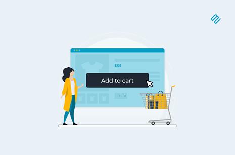
Figure 7: Adding a product to the cart
(Source: Barn2, 2025)
Visibility of System Status: Every action a user took adding a product to the cart, applying a promo code triggered visual feedback, like a pop-up or notification bar (Ekaputeri, 2024). This helped users feel confident that the system had registered their input.
User Control and Freedom: Users could remove items from their cart, edit quantities, go back to previous pages, or switch payment modes without losing progress. These small affordances gave users a sense of control.
Recognition over Recall: Rather than asking users to type specifications or filter manually, I introduced dropdowns, icon filters like for brands or colours, and predictive search all of which support recognition-based browsing (Zhu and Lv, 2023).
Minimalist Design: I embraced white space, used a balanced colour palette, and cut down on non-essential elements. Each page had a clear focus whether that was browsing, learning, or purchasing.
These principles helped transform the site from a feature-heavy platform to a user-focused one.
9. Iteration and Learning from Mistakes
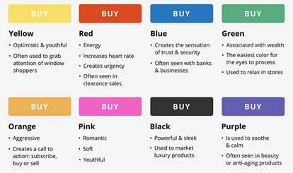
Figure 8: CTA buttons colours
(Source: Red-website-design, 2025)
Not every idea worked the first time, and I think that’s what made the project even more rewarding. Initially, I used muted colours for CTA buttons, but during testing, they did not get much engagement (ESCAP, 2022). I changed them to high-contrast colours and saw click rates improve.
Another mistake I made was over-categorising products in the menu, which made navigation confusing. After usability testing, I revised it to include fewer, broader categories with the option to drill down later.
These iterations reminded me that UX design is not about perfection it is about progress. Testing and refining are essential steps in creating something truly useful.
10. Practical improvements for future development
Personalised AI-Powered Product Recommendations
While the current redesign streamlines navigation and simplifies product discovery, future development could enhance personalisation by integrating AI-based recommendation engines. These would analyse a user’s browsing history, purchase behaviour, and wish lists to display more relevant products on the homepage and product pages (Iqbal, 2022). For example, instead of a generic “Trending Deals” section, users could see a “Picked Just for You” carousel, increasing engagement and conversion rates. Personalisation improves user satisfaction by making the experience feel uniquely tailored and time-saving.
Accessibility Features for Inclusive Design
To make Flipkart more inclusive and user-friendly for all users, future updates should include advanced accessibility features such as screen reader compatibility, voice search, high contrast modes, and keyboard navigation. Many users with visual or motor impairments struggle with standard web layouts. By incorporating the Web Content Accessibility Guidelines (WCAG 2.2), Flipkart can ensure that its platform is equitable and compliant with global standards (Sikder, 2023). This not only broadens the user base but also reflects a socially responsible design ethos.
11.Conclusion
This project was more than just an academic or creative exercise. It was a lesson in empathy, communication, visual storytelling, and real-world problem solving. I walked away not only with a deeper appreciation for UX design but also with a clear reminder of what digital experiences should feel like seamless, human, and joyful.
Redesigning Flipkart’s interface showed me how even small changes like clearer menus, warmer copy, or faster checkout can make a user feel seen, supported, and satisfied. And at the end of the day, that’s what great UX is all about.
References
Albiz, J., Viberg, O. and Matviienko, A., 2023, October. Guiding visual attention on 2d screens: Effects of gaze cues from avatars and humans. In Proceedings of the 2023 ACM Symposium on Spatial User Interaction (pp. 1-9). https://dl.acm.org/doi/abs/10.1145/3607822.3614529
Barn2, 2025. How to successfully implement ajax add to cart in WooCommerce, Available at: https://barn2.com/blog/woocommerce-ajax-add-to-cart/ (Accessed 23 April 2025).
Chen, C.H. and Zhai, W., 2023. The effects of information layout, display mode, and gender difference on the user interface design of mobile shopping applications. IEEE Access, 11, pp.47024-47039. https://ieeexplore.ieee.org/abstract/document/10121686/
Ekaputeri, G.K.A., 2024. Concept and Implementation of Trigger-Based Explanations (Doctoral dissertation, Leibniz University Hannover). https://www.pi.uni-hannover.de/fileadmin/pi/se/Stud-Arbeiten/2024/MA-Ekaputeri-2024.pdf
ESCAP, U., 2022. Beginners’ manual on digital marketing and e-commerce. https://repository.unescap.org/handle/20.500.12870/4460
Figma, 2025. Available at: https://www.figma.com/design/KfPV1D3ealGV8UzX4uJwge/Flipkart-Website-UI-UX-Design?node-id=163-2539&t=ah3LNCQqPXZbMDRL-0 (Accessed 23 April 2025).
Hu, L., Pan, X., Ding, S. and Kang, R., 2022. Human decision time in uncertain binary choice. Symmetry, 14(2), p.201. https://www.mdpi.com/2073-8994/14/2/201
Iqbal, M., 2022. Machine learning applications in e-commerce. Organization, Business and Management, 65. https://www.researchgate.net/profile/Dr-Manju-Lata-2/publication/365839229_The_Future_of_E-Commerce/links/63cbdaf36fe15d6a5739379f/The-Future-of-E-Commerce.pdf#page=79
Joshi, K. and Mudliar, P., 2025. Reselling Practices in a Textile Bazaar: Translating E-Commerce Platforms to WhatsApp. https://www.researchgate.net/profile/Kartik-Joshi-9/publication/389395868_Reselling_Practices_in_a_Textile_Bazaar_Translating_E-Commerce_Platforms_to_WhatsApp/links/67c0b1c5645ef274a4966433/Reselling-Practices-in-a-Textile-Bazaar-Translating-E-Commerce-Platforms-to-WhatsApp.pdf
Nngroup, 2025. The Four Dimensions of Tone of Voice, Available at: https://www.nngroup.com/articles/tone-of-voice-dimensions/ (Accessed 23 April 2025).
Priyadarsini, D., 2022. Study on Flipkart Supply Chain Management System–warehouse Operations (Doctoral dissertation, BIITM, Bhubaneswar). http://biitm.dspaces.org/bitstream/123456789/414/1/Flipkart%20-%20SIP%20Report.%20DIBYASHA%20PRIYADARSINI37.pdf
Red-website-design, 2025. How to Choose a CTA Button Colour for a High Converting Website, Available at: https://red-website-design.co.uk/cta-button-colour/ (Accessed 23 April 2025).
Sandil, N., 2022. Operation of Return Centre of FLIPKART (Doctoral dissertation, BIITM, Bhubaneswar). http://biitm.dspaces.org/bitstream/123456789/458/1/NIVEDITA-converted.pdf
Sikder, A.S., 2023. The Evolution of Web Accessibility Guidelines: A Comparative Analysis of WCAG 2.0 and WCAG 3.0 in Ensuring Inclusivity on the Web.: WCAG 2.0 and WCAG 3.0 in Ensuring Inclusivity on the Web. International Journal of Imminent Science & Technology., 1(1), pp.170-185. https://www.ijisnt.com/journal/index.php/public_html/article/view/18
Stockarea, 2025. Amazon Vs Flipkart: Who is dominating Indian Ecommerce? Available at: https://stockarea.io/blogs/amazon-vs-flipkart-who-is-dominating-indian-ecommerce/ (Accessed 23 April 2025).
Strauss, I., O’Reilly, T. and Mazzucato, M., 2024. Amazon’s Algorithmic Rents: The Economics of Information on Amazon. UC L. Sci. & Tech. J., 15, p.203. https://heinonline.org/hol-cgi-bin/get_pdf.cgi?handle=hein.journals/hascietlj15§ion=12
Techtarget, 2025. Hick’s law, Available at: https://www.techtarget.com/whatis/definition/Hicks-law (Accessed 23 April 2025).
Think360studio, 2025. Z Pattern, Available at: https://think360studio.com/blog/z-pattern (Accessed 23 April 2025).
Vidani, J., 2024. To Study Effectiveness of Online Payment Modes. Available at SSRN 4849748. https://papers.ssrn.com/sol3/papers.cfm?abstract_id=4849748
Zhu, L. and Lv, J., 2023. Review of studies on user research based on EEG and eye tracking. Applied Sciences, 13(11), p.6502. https://www.mdpi.com/2076-3417/13/11/6502